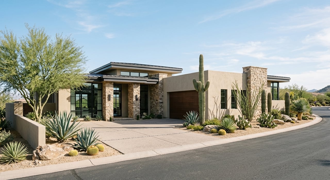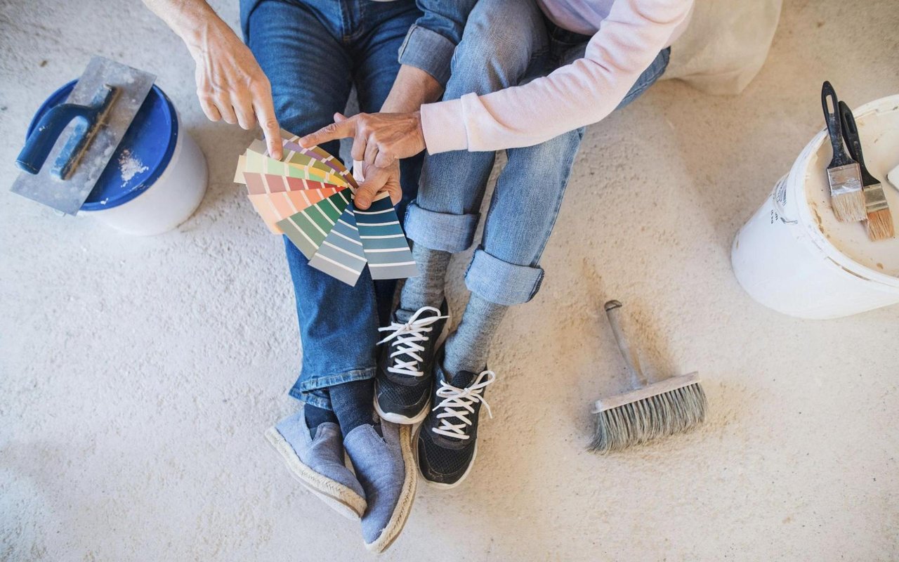
Color isn’t just about aesthetics — it’s a powerful tool that affects your mood, energy, and even how large or small a room feels. If you’re planning to repaint your Scottsdale home, choosing the right shades is about more than personal preference. The desert landscape, abundant natural light, and indoor-outdoor lifestyle all influence which tones will feel right in each space. With the right color science, you can transform your home into a cohesive, stylish retreat that enhances your everyday life.
From soft earth tones that echo the Sonoran Desert to bold hues that energize your space, your choices matter. This guide will help you understand how to approach each room with intention, select the right paint finish, and build a color story that makes your home feel thoughtfully designed.
Whether you’re updating a single space or refreshing your entire home, you’ll learn how to choose colors that reflect your personality and your home’s unique architecture.
How Color Impacts Mood And Perception
Before you reach for a paint swatch, it’s important to understand how color influences how you feel and behave. Warm colors like red, orange, and yellow are energizing and tend to make a room feel more active. Cool colors, such as blue, green, and lavender, evoke calm, encourage relaxation, and create the illusion of a larger space.
Color also affects temperature perception, both physically and emotionally. In Scottsdale, where the sun shines more than 300 days a year, cooler hues often feel more refreshing in rooms with direct sunlight. That doesn’t mean you need to paint everything blue. Instead, look for cool undertones in neutrals, grays, and whites to balance brightness and maintain a grounded feel.
Lighting plays a central role as well. Natural sunlight can wash out certain hues or intensify others, especially in homes with expansive windows. The time of day and the direction a room faces will shift how the color appears. That’s why sampling a paint color in your living space, during different times of day, is essential before committing.
Create A Cohesive Color Palette For Your Home
Consistency doesn’t mean that every room has to be the same color — but a cohesive palette ensures your home flows beautifully from room to room. A whole-home color story starts with a base: typically a neutral like soft beige, greige, ivory, or a cool white. These tones work as a foundation for more saturated or dramatic hues in accent walls, cabinetry, or decor.
In Scottsdale homes, sandy taupes, muted terracottas, and desert-inspired neutrals often feel natural and timeless. They echo the tones of the surrounding landscape, complement stone or wood finishes, and work well in open-concept floor plans. Pair them with accent colors drawn from nature — think sage green, midnight blue, or sunbaked coral — to bring richness and dimension.
Choose two to three primary colors and a few supporting accent shades. Use the 60-30-10 rule as a guideline, with 60% of the room in the dominant color, 30% in the secondary, and 10% in a bold or unexpected accent. This structure creates visual balance without feeling too rigid.
Choosing Paint Colors For Living Rooms And Common Areas
Living rooms are where you entertain, relax, and spend time with others, so your color choices should feel both welcoming and functional. In Scottsdale, many living rooms feature abundant natural light, architectural details like ceiling beams or niches, and indoor-outdoor transitions to patios or pools. Consider a warm neutral on the walls to anchor the space — think creamy white, beige, or soft tan.
If you want a cozy, moody effect, go for charcoal, olive, or even navy. These darker tones work well when balanced with lighter trim or metallic accents. To keep things light and airy, pale taupes or barely-there blues can reflect light without feeling cold.
Don’t forget the ceiling — painting it a soft shade that complements your walls can make the space feel more polished. A subtle off-white with a drop of the wall color can visually expand the height of the room and soften transitions.
Selecting Calming Colors For Bedrooms
Your bedroom should be a place of rest and restoration. That’s why cool tones tend to be the most popular choice. Shades of blue, soft lavender, or warm gray can create a tranquil environment perfect for winding down at night. Avoid intense reds or vivid yellows, which are more stimulating and can disrupt the relaxed mood you want to achieve.
In primary bedrooms, consider deeper shades like slate blue or dusty plum for a cozy cocoon effect. In guest rooms, lighter tones like sage or blush can feel universally appealing without being too bold. Layer in color through bedding and accent pieces to complement your walls and add depth to the space.
In primary bedrooms, consider deeper shades like slate blue or dusty plum for a cozy cocoon effect. In guest rooms, lighter tones like sage or blush can feel universally appealing without being too bold. Layer in color through bedding and accent pieces to complement your walls and add depth to the space.
Brightening Kitchens
Kitchens are among the most high-traffic areas in your home, and they benefit from colors that feel clean, fresh, and energizing. Whites and off-whites remain classic choices for cabinetry and walls because they reflect light, make the space feel larger, and pair well with natural materials like quartz, granite, or hardwood.
If you want to add more personality, consider a two-tone cabinet design — upper cabinets in a soft white and lower cabinets in a sage green, pale blue, or even deep charcoal. A subtle gray, clay tone, or buttery beige can complement tile or countertops without clashing.
In modern Scottsdale kitchens, desert tones like muted terracotta, sand, and sandstone reflect the outdoor palette and create a warm, earthy ambiance. When used in small doses — like a painted island or backsplash — these colors add charm without overwhelming the space.
Making A Statement In Dining Rooms And Accent Walls
Dining rooms and formal entertaining spaces offer an opportunity to go bold. Rich jewel tones like navy, burgundy, or forest green create a sense of drama, especially when paired with statement lighting or elegant decor. Accent walls — whether in a dining room, hallway, or entry — let you experiment with deeper hues without committing to an entire room.
Scottsdale homes with open floor plans can benefit from using color to define specific spaces. A painted accent wall in the dining area can separate it visually from the living room. To keep the effect polished, use clean lines and balance bolder tones with neutral flooring or accessories.
Paint finishes matter. Matte and eggshell finishes offer a more sophisticated, velvety appearance, while gloss or semi-gloss creates sheen and dimension. For high-traffic areas, durability is also a key factor to consider.
Tying It All Together With A Thoughtful Approach
Color is more than paint — it’s part of your home’s personality. A thoughtfully chosen palette enhances your mood, improves your day-to-day experience, and makes your Scottsdale home feel like a true reflection of you. By understanding how light, finish, and emotion play into your choices, you can create a home that’s not just beautiful but intentional.
Paint is one of the most powerful — and affordable — ways to transform your home. With the right strategy and a little bit of science, each room can feel tailored, elevated, and cohesive.
Connect with the Tackett Team for trusted insight as you explore your real estate options in Scottsdale.
Paint is one of the most powerful — and affordable — ways to transform your home. With the right strategy and a little bit of science, each room can feel tailored, elevated, and cohesive.
Connect with the Tackett Team for trusted insight as you explore your real estate options in Scottsdale.